This blog entry is about the process I went through while designing my own 16 color terminal scheme, as an improvement to "Solarized light". Since I invested some time in it, I decided that I want to document it somewhere, just in case if later I will need to go back and revisit things.
What Is This All About
I need to make some introduction into terminals to ensure that I'm on the same page with readers. Terminals were one of the first ways to establish truly interactive communication between people and computers. You type a command, and the computer prints the result, or vice versa—the computer asks you "do you really want to delete this file?", and you type "y" or "n". First terminals were sort of electric typewriters—noisy and slow, thus the conversation between computers and humans was really terse. However, even then interactive text editors had become technically feasible, take a look at the "standard text editor" of UNIX—ed. Later, so called "glass terminals" (CRT monitors with keyboards) arrived, giving an opportunity to more "visual" and thus more productive interaction, and the "Editor war" had begun.
And basically, these visual terminals is what is still being emulated by all UNIX derivatives these days: the "text mode" of Linux, XTerm program, macOS Terminal app, countless 3rd party terminals, even browser-based terminals—these can run on any desktop OS. In fact, I use hterm for hosting my editor where I'm preparing this text.
As the terminal technology was evolving over time, it was becoming more sophisticated. Capabilities of teletype terminals were very basic: print a character, move the caret left or right, go to next line. "Glass terminals" enabled arbitrary cursor positioning, and then with the advent of new hardware technologies, color was added. Having that the evolution of hardware was taking time, color capabilities were developing in steps: monochrome, 8 colors, 16 colors, 256 colors, and finally these days—"truecolor" (8-bit color). Despite all the crowd excitement about the latter, I believe that "less is more," and the use a restricted color set in text-based programs still has some benefits.
Before I go into details, one thing that I would like to clarify is the difference between the number of colors that are available to programs running under a terminal emulator (console utilities, editors with text UI, etc), and the number of colors used by the terminal emulator program itself. The terminal program is in fact only limited by the color capabilities of the display. Even when a console utility outputs monochrome text, the terminal emulator can still use full color display capabilities for implementing nice-looking rendering of fonts and for displaying semi-opaque overlays—the cursor being the simplest example. Thus, setting the terminal to the 16-color mode does not mean we get back to 1980-s in terms of the quality of the picture. And unless one runs console programs that, for example attempt to display full color images using pseudo-graphic characters, or want to use gradient backgrounds, it might get unnoticed that a 16-color terminal mode is in fact being used.
Getting Solarized
I remember the trend popular among computer users of avoiding being exposed to the blue light from computer displays—maybe it is still a thing?—even Apple products offer the "Night shift" feature. Users of non-Apple products got themselves yellow-tinted "computer" glasses or were following advises to turn down the blue component in color settings of their monitors. The resulting image looks more like a page of a printed book when reading outdoors (if tuning is done sensibly, not to the point when white color becomes bright yellow), and probably makes less strain on the eyes. The same result on a terminal emulator can be achieved without any hardware tweaks by applying a popular 16-color theme called "Solarized light" by Ethan Schoonover.
I remember being hooked on the "signature" yellowish background color of this theme (glancing over shoulders of my colleagues, a lot of people are). I never liked the "dark" version because it does not look like a paper page at all. So I was setting up all my terminal emulators to use "Solarized light", and was quite happy about the result.
However, at some point I noticed that color-themed code in my Emacs editor—I run it in "non-windowed", that is, text mode under the aforementioned hterm terminal emulator—does not look like screenshots on the Ethan's page. Instead, C++ code, for example, looked like this (using some code from the Internet as an example):

I started digging down for the cause of that and discovered that
every "mature" mode of Emacs basically declares 4
different color schemes: for use with 16-color terminals, and for 256-
(actually, >88) color terminals, both having a version for dark and
light terminal background. Sometimes, a scheme specific to 8-color
terminals is also added. Below is an example from
font-lock.el:
(defface font-lock-function-name-face
  '((((class color) (min-colors 88) (background light)) :foreground "Blue1")
    (((class color) (min-colors 88) (background dark))  :foreground "LightSkyBlue")
    (((class color) (min-colors 16) (background light)) :foreground "Blue")
    (((class color) (min-colors 16) (background dark))  :foreground "LightSkyBlue")
    (((class color) (min-colors 8)) :foreground "blue" :weight bold)
    (t :inverse-video t :weight bold))
  "Font Lock mode face used to highlight function names."
  :group 'font-lock-faces)
Thus, in reality in my C++ example display only foreground and background text colors are originating from the Solarized theme, and all other colors are coming from the 256-color scheme of the Emacs C++ mode. Names of colors used in this case (like "LightSkyBlue" above) come from the "X11 palette", and there are many gradations and tints to choose from for every basic color.
In fact, this is one of the drawbacks of the 256- and true-color modes (in my opinion, of course)—apps have too much control over colors, and this leads to inconsistency. For me, too much effort would be required to go over all Emacs modes that I use and ensure that their use of colors is mutually consistent. Whereas, in the 16-color mode not only apps have to use a restricted set of colors, but the set itself is in fact a terminal-controlled palette. Thus, the app only specifies the name of the color it wants to use, for example "red", and then the terminal setup defines which exact tint of red to use. So, one day I switched my terminal to only allow 16 colors, and restarted Emacs...

...And I did not like the result at all! Yes, now I could see I'm indeed using the palette of the "Solarized light" theme, but the result looks quite bleak. I took another look at the screenshots on the Ethan's page and realized that to me the colors of the Solarized palette look more engaging on a dark background. I read that the point of Ethan's design was to allow switching between dark and light backgrounds with a minimal reshuffling of colors, and still having "identical readability." However, to my eyes "readability" wasn't the same as "looking attractive."
As I tried using the Solarized light palette for doing may usual tasks in Emacs, I found that it has a couple more shortcomings. Let's look at the palette:
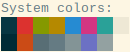
One thing that bugged me is that the orange color does not look much different from red. I can see that even with color blocks, and with text the similarity goes up to the point that when I was looking at text colored in orange, I could not stop myself from perceiving it as being in red. People are not very good at recalling how "absolute" colors look, we are much better at comparing them when they are side by side.
Another serious problem was the lack of "background" colors enough for my text highlighting needs. I'm not sure about Vim users, but in Emacs I have a lot of uses for background highlights. I can enumerate them:
- highlighting the current line;
- text selection;
- the current match of interactive search;
- all other matches of interactive search;
- character differences in diffs (highlighted over line differences);
- highlighting of "ours", "theirs", and patch changes in a 3-way merge;
- and so on.
Most of those highlights must have a color on their own so they don't hide each other when I combine them, and they must not make any of text colors unreadable due to a poor contrast. As an example, if I have a colorized source code, and I'm selecting text, I still should be able to see clearly every symbol of it. This is where the Solarized palette falls short, and I can easily explain why.
Color Engineering
One of the defining features of the Solarized palette is that it was
created using the Lab color space. Previously, 16 color
palettes were usually assigned colors based on the mapping of the color
number in the binary form: from 0000 to 1111,
onto a tuple of (intensity, red, green, blue) bits, not caring
too much about how the resulting colors look to users. Whereas, the
Lab color space is modeled after human perception of color, and
can help in achieving results which are more consistent and thus more
aesthetically pleasing.
The first number in the Lab triad is the luminosity of the color. Let's look at the "official" palette definition in this model:
SOLARIZED L*A*B
--------- ----------
base03    15 -12 -12
base02    20 -12 -12
base01    45 -07 -07
base00    50 -07 -07
base0     60 -06 -03
base1     65 -05 -02
base2     92 -00  10
base3     97  00  10
yellow    60  10  65
orange    50  50  55
red       50  65  45
magenta   50  65 -05
violet    50  15 -45
blue      55 -10 -45
cyan      60 -35 -05
green     60 -20  65
We can see that most colors have luminosity in the range between
45 and 65, with only two of them
having either low luminosity: base03 and
base02, or high luminosity: base2 and
base3. Thus, these colors are the only ones that can serve
as backgrounds that work with any text color. Having that one of those
4 background colors is the actual background, only
3 remain—certainly not enough for my use case.
After considering these shortcomings, I decided to tweak the "Solarized light" palette to better suit my needs. Below is the list of my goals:
- Use colors that look more vivid with a light background.
- Make sure that no two colors look alike when used for text.
- Provide more background colors.
And the list of my non-goals, compared to Ethan's goals:
- No need to use text colors with a dark background.
- Can consider bold text as yet another text color.
In the design process I also used the Lab color space. Thanks to the non-goal 1., I was able to lower the minimum luminosity down to 35. I made some of the colors more vivid by increasing color intensities—as a starting point I took some of the colors used by the 256 color scheme of the C++ mode in Emacs.
In order to make the orange color to be visually different from red, I created a gradient between red and yellow, and picked up the orange tint which I was seeing as "dividing" between those two, in order to guarantee that it is the most distant tint from both red and yellow.
I decided to reduce the number of gray shades in the palette. For non-colored text, I planned to use the following monotones:
base1for darker than normal text;base2for lighter than normal, less readable text, I moved it to the "bright black" position in the palette;- bold normal text for emphasis.
And here comes a hack! I moved the normal text color
(base00 in the "Solarized light" theme) out of the palette
and made it the "text color" of the terminal. Remember when I said that
the terminal emulator program does not have to restrict itself to
16 colors. Most contemporary terminal emulators allow
to define at least 3 additional colors which do not
have to coincide with any of the colors from the primary palette: the
text color, the background color, and the cursor color. The first two
are used "by default" when the program running in the terminal does not
make any explicit text color choice. Also, any program that does use
colors can always reset the text color to this default.
Let's pause for a moment and do some accounting for colors that I have already defined in the 16 color palette:
- 2 text colors (plus the text color in the terminal app);
- 8 accent colors: red, orange, yellow, green, cyan, blue, magenta, and violet;
- 1 background color (this is used when one needs to print text on a dark background, without dealing with "reverse" text attribute which usually looks like a disaster).
Thus we have 16 - 11 = 5, which means there are
5 color slots left for highlights, that's
2 more than in the "Solarized light" theme, and they
are real colors, not shades of gray! Since I removed or moved away the
shades of gray used by the original Colorized palette, I placed the
highlights where grays used to be, as "bright" versions of corresponding
colors.
When choosing color values for the highlights, I deliberately made them very bright (high value of luminosity) to make a good contrast will any color used for text. One difficulty with very bright colors is making them visually distinctive, to avoid confusing "light cyan" with "light gray" for example.
This is the palette I ended up with, and it's comparison with "Solarized light" (on the left):
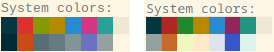
And below is the comparison of the Lab values, along with a "web color" RGB triplet. Compared to the initial table I took from the Solarized page, I have rearranged colors in the palette order:
PALETTE        SOLARIZED L*A*B       COLORIZED   HEX
-------------- --------- ----------  ----------  -------
Black          base02    20 -12 -12  20 -12 -12  #043642
Red            red       50  65  45  40  55  40  #b12621
Green          green     60 -20  65  50 -45  40  #1f892b
Yellow         yellow    60  10  65  60  10  65  #b68900
Blue           blue      55 -10 -45  55 -10 -45  #268bd2
Magenta        magenta   50  65 -05  35  50 -05  #94245c
Cyan           cyan      60 -35 -05  55 -35  00  #249482
Light Gray     base2     92  00  10  92  00  10  #eee8d6
Bright Black   base03    15 -12 -12  65 -05 -02  #93a1a1
Bright Red     orange    50  50  55  55  35  50  #c7692b
Bright Green   base01    45 -07 -07  96 -10  25  #eef9c2
Bright Yellow  base00    50 -07 -07  94  03  20  #ffeac7
Bright Blue    base0     60 -06 -03  90  00 -05  #dfe3ec
Bright Magenta violet    50  15 -45  40  20 -65  #3657cb
Bright Cyan    base1     65 -05 -02  94 -08  00  #ddf3ed
White          base3     97  00  10  97  00  10  #fdf6e4
Text Color                           50 -07 -07  #657b83
Cursor Color                     Bright Magenta, opacity 40%
(Note that even for colors that retain their Lab values from Solarized, I may have provided slightly different RGB values compared to those you can find on Ethan's page. This could be due to small discrepancies in color profiles used for conversion, and unlikely produce noticeable differences.)
Compared to the "Solarized light" palette, I have redefined 6 accent colors, and thrown away 2 "base" colors. I decided to name my palette "Colorized," both as a nod to "Solarized" which it is based on, and as a reference to the fact that it looks more colorful than its parent.
Emacs Customizations
Besides defining my own palette, I also had to make some tweaks in Emacs in order to use it to full extent. While customizing colors of the C/C++ mode, I made it visually similar to the 256 color scheme I was using before, but more well-tempered:

Shell Mode
It's a well known trick to enable interpretation of ANSI escape sequences for setting color in the "shell" mode of Emacs:
(require 'ansi-color)
(add-hook 'shell-mode-hook 'ansi-color-for-comint-mode-on)
What is less known is that we can then properly advertise this
ability to terminal applications via the TERM variable by
setting it to dumb-emacs-ansi. This is a valid termcap /
terminfo entry, you can find it in the
official terminfo source from the ncurses package.
Besides that, it's also possible to map these ANSI color sequences to terminal colors arbitrarily. For example, I mapped "bright" colors onto bold text. This comes handy both for the original Solarized palette and my Colorized one because "bright" colors in it are in reality not bright versions of the first 8 colors, thus when apps try using them the resulting output looks unreadable.
The full list of Emacs customizations is in this setup file. It's awesome that when using it, I naturally forget that only 16 colors (OK, to be fair, 17, if you recall the terminal text color hack) are used. This way, I have proven to myself that use of "true color", or even 256 color terminal is not required for achieving good looks of terminal applications.
Conclusion
Big kudos to Ethan Schoonover for creating the original Solarized theme and explaining the rationale behind it. The theme is minimalist yet attractive, and proves that it's possible to achieve more with less.
No comments:
Post a Comment